

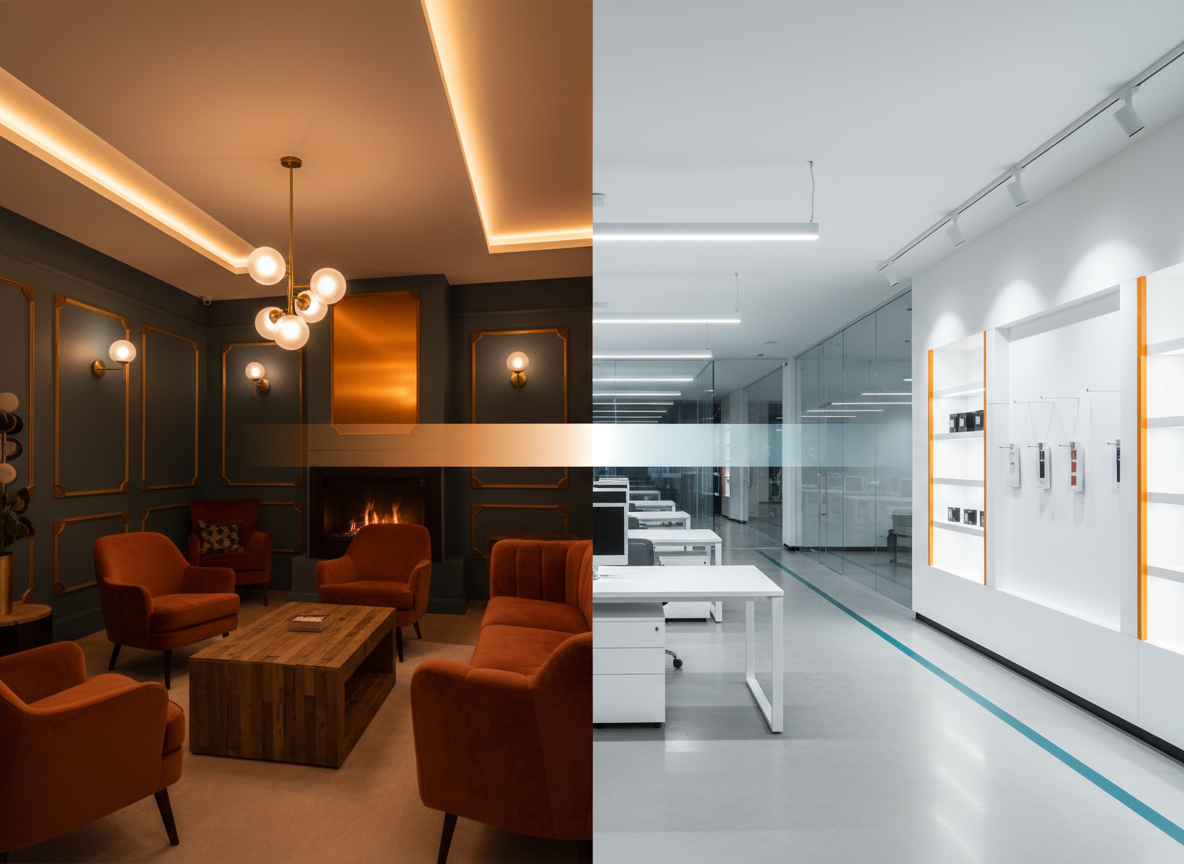

Most people in the trades know that 3000K is “warm” and 5000K is “cool.” They know that hospitality spaces get warm light and warehouses get cool light. They've specified Kelvin ratings on submittals, argued about them in punch lists, and corrected confused end users more times than they can count.
And yet, some of the most persistent misconceptions in commercial lighting are built directly on top of CCT. Facilities managers swap lamp types and wonder why the room looks different even though both fixtures say 3000K. Designers spec 5000K because they think it's more accurate to daylight. Electricians assume dimming doesn't touch color. These aren't fringe mistakes — they show up constantly in the field.
If you're walking job sites, reviewing submittals, or commissioning lighting control systems, CCT is a metric you interact with every single day. It's worth understanding it precisely — not just the rule-of-thumb version.
What Is Correlated Color Temperature?
Color temperature is a way of describing the hue of a light source using a single number measured in Kelvin (K). The lower the number, the warmer and more orange-red the light appears. The higher the number, the cooler and more blue-white it looks.
But that straightforward description skips something important: the word correlated.
The concept of color temperature originates with what physicists call a blackbody radiator — a theoretical perfect absorber and emitter of radiation. When you heat a blackbody, it glows. At lower temperatures, that glow is deep red. As it gets hotter, it moves through orange, then yellow-white, then blue-white. The specific color at each temperature is mathematically precise and forms a curve called the Planckian locus on a color diagram.
Here's the problem: most light sources don't land exactly on that curve. Fluorescent lamps, LEDs, HID sources — their color points sit near the Planckian locus, but not on it. So we can't assign them a true color temperature. Instead, we find the point on the Planckian locus closest to the actual color of the light source and report that temperature as the correlated color temperature. That's why it's called CCT rather than simply color temperature — it's a nearest-neighbor approximation, not an exact match.
The Kelvin scale itself is named after the 19th-century British physicist William Thomson, later Lord Kelvin, who formalized the thermodynamic temperature scale. Zero Kelvin (0 K) is absolute zero — room temperature is roughly 293 K, and the sun's surface is around 5778 K.
A Brief History of CCT in Lighting
The story starts in 1900, when German physicist Max Planck published his landmark work on blackbody radiation. His solution to explaining how objects glow when heated introduced the idea of quantized energy — effectively launching quantum mechanics — and produced a precise mathematical description of the relationship between temperature and emitted light color.
For the first half of the 20th century, this was largely theoretical. Incandescent lamps behave much like blackbody radiators — a standard A19 incandescent burns at roughly 2700 K, which also happens to be close to where it sits on the Planckian locus. For incandescent sources, CCT and actual color temperature nearly coincide.
The International Commission on Illumination (CIE) formalized correlated color temperature as fluorescent and HID sources became dominant through the mid-20th century. These produce light through gas discharge and phosphor excitation — mechanisms that don't follow blackbody behavior. The CIE established the mathematical method for computing CCT from a source's chromaticity coordinates, giving the industry a standardized way to describe the apparent color of any source with a single number.
The LED era made CCT a primary specification metric in a way it had never been before. LEDs give manufacturers extraordinary flexibility in tuning spectral output — the same LED package can be produced at 2700K, 3000K, 3500K, 4000K, or 5000K depending on phosphor formulation and chip binning. That flexibility moved CCT from a descriptive label to an active design parameter, and elevated the importance of understanding what CCT can and cannot tell you about a source.
The CCT Scale in Practice
| CCT Range | Label | Visual Character | Typical Applications |
|---|---|---|---|
| 2700K | Warm White | Incandescent glow, amber, intimate | Residential, hospitality, restaurants, hotels |
| 3000K | Warm White (Commercial) | Warm but slightly crisper | High-end retail, lobbies, spas, restaurants |
| 3500K | Neutral White | Balanced, neither warm nor cool | Healthcare, offices, mixed-use commercial |
| 4000K | Cool White | Clean, crisp, energizing | Open offices, classrooms, retail, parking |
| 5000K+ | Daylight / Cool | Blue-white, high-energy, clinical | Warehouses, industrial, some healthcare |
2700K vs. 3000K is a meaningful difference. The 300K gap may sound small, but in a hospitality application it can shift the perceived ambiance noticeably — affecting food appearance, skin tone rendering, and the atmosphere the designer and owner are paying to achieve.
3500K is underused. It occupies an underappreciated sweet spot in healthcare and education — warm enough to avoid a clinical feel, neutral enough to support visual task performance. When a project has conflicting requirements, 3500K in a consistent spec can eliminate the need for two separate CCT families.
4000K is the current commercial standard. It became dominant as T8 fluorescent systems optimized around it, and LED manufacturers followed. In most control system specs you encounter, 4000K is the baseline assumption unless otherwise noted.
5000K does not mean better color rendering. That particular myth gets its own section below.
CCT vs. Color Appearance: The Nuance That Trips Up Specifications
Two luminaires with the same CCT rating can look dramatically different in a space. Several factors influence how a 3000K source actually appears to occupants:
- CRI (Color Rendering Index): A 3000K source with a CRI of 70 will look duller and less vibrant than a 3000K source with CRI 90+, even though both measure at the same correlated color temperature. CRI describes how accurately a source renders the colors of objects it illuminates — low CRI at any CCT tends to produce a visually flat, washed-out appearance. The IES's newer TM-30 metric takes color rendition evaluation significantly further, adding a gamut index (Rg) that measures vividness — something CRI can't tell you at all. If you're specifying for retail, healthcare, or any environment where color quality truly matters, it's worth understanding both. We've done a full comparison of TM-30 vs. CRI here.
- Surface materials and reflectances: Light color is not experienced in isolation — it bounces off walls, floors, furniture, and ceilings before reaching the eye. A 3000K fixture in a room with warm-toned wood paneling will appear significantly warmer than the same fixture in a white-painted room with cool gray carpet.
- Chromatic adaptation: The human visual system adapts to the predominant color of its environment. Someone walking into a 3000K room after spending time in a 5000K office will initially perceive the room as very warm. After a few minutes, their visual system adapts and the room begins to feel neutral.
- Adjacent zones: In open-plan environments where multiple CCT zones are visible simultaneously, the contrast between them amplifies the apparent difference. A 3000K lounge area adjacent to a 4000K open office will look warmer than the same 3000K zone in isolation.
The practical takeaway: CCT is a starting point, not a complete specification. When lighting controls allow for tunable CCT, these interactions between the source, the space, and the occupants become active design variables rather than fixed constraints.
Common CCT Myths — Busted
These are the misconceptions that show up repeatedly in the field, in submittal reviews, and in conversations with facilities staff. Each one has a kernel of intuitive logic that makes it stick — and each one, when acted on, produces results neither the designer nor the owner intended.
Myth 1: Higher CCT Means Brighter Light
This one persists because cooler light feels more alerting and visually energizing. That's a real perceptual effect — blue-enriched light activates the intrinsically photosensitive retinal ganglion cells (ipRGCs) that regulate circadian response and arousal. So 5000K light does make you feel more awake.
But brightness — measured in lumens, footcandles, or lux — is a function of the amount of light, not its color. A 1000-lumen, 5000K lamp and a 1000-lumen, 2700K lamp produce the same illuminance on a horizontal surface. Always specify and compare light sources by lumen output and maintained footcandle levels independently of CCT.
Myth 2: 5000K Is the Most Accurate or Most Natural Color
Noon sunlight is approximately 5500K–6500K. If you want “natural” light, shouldn't you match the sun? The problem is our visual system evolved in an environment where light changes continuously — from 1800K at sunrise to 6500K at solar noon to 2000K at sunset. The static “most natural” framing doesn't hold.
Worse, the surfaces inside most buildings are specified and evaluated under 3000K–4000K lighting. Install 5000K and everything designed to look warm and inviting suddenly looks clinical. For accurate color evaluation, the relevant spec is CRI and R9 — not CCT. A 3500K source with CRI 95 will render color more accurately than a 5000K source with CRI 75.
Myth 3: CCT Tells You How Good the Color Rendering Is
CCT describes the hue of the light. CRI describes how accurately the light renders the colors of objects. These are independent metrics. You can have warm light that renders color poorly (a 2700K fluorescent with CRI 65) and warm light that renders color beautifully (a 2700K LED with CRI 95+). The CCT will look similar in both cases; the experience of standing in the room will not.
When reviewers mark up submittals and see a 3000K LED fixture, they are getting zero information about color rendering quality unless CRI is also listed. Always specify both.
And if you want to go further than CRI alone — which has real limitations around sample set, averaging, and its inability to measure color vividness — the IES developed TM-30 specifically to address those gaps. It's not yet in most energy codes, but it's the more complete tool for critical applications. Our full TM-30 vs. CRI breakdown is a good place to start.
Myth 4: All 3000K LEDs Look the Same
They absolutely do not, and this myth costs owners and designers money when luminaire substitutions are approved on CCT alone. Two LEDs both rated 3000K can have chromaticity coordinates that are measurably — and visibly — different.
The industry standard for measuring this variation is the MacAdam ellipse (SDCM — Standard Deviation of Color Matching). A 3-SDCM tolerance is acceptable for most applications; 7-SDCM means a clearly visible color difference. Commodity fixtures often come from multiple bins at 5-SDCM or wider — resulting in a patchwork of subtly different hues across a uniform ceiling, all technically “3000K.” Specify maximum SDCM tolerance and require consistent binning across the project.
Myth 5: Warmer CCT Is Always Better for Hospitality and Restaurants
Warm light is generally the right choice for hospitality, but “warmer is always better” can backfire. Very low CCT (2700K and below) can suppress visual task performance in staff work areas — server stations, bar prep, host stands. More importantly, CCT interacts with the specific finishes a designer has specified. The same 2700K that looks stunning in a light-wood, soft-white restaurant can look flat and muddy in a space with dark, saturated surfaces. Start with the design intent, understand the materials, then select CCT — not the other way around.
Myth 6: CCT Is Fixed and Doesn't Change With Dimming
For traditional phosphor-converted white LEDs this is mostly true — but there are important exceptions:
Warm dimming LEDs are intentionally designed to shift toward lower CCT as they dim, mimicking incandescent behavior. A fixture spec'd at 3000K at full output might measure closer to 2200K at 10% level. This shift must be accounted for in control system programming.
RGBW and tunable white systems actively change CCT as a function of the control input. CCT is not a fixed property — it is a variable. Misunderstanding this leads to commissioning errors where a "neutral" scene is requested and the system defaults to a blended CCT that doesn't match design intent.
Color shift at very low dim levels can occur in lower-quality LEDs due to changes in phosphor thermal behavior at reduced drive current.
Myth 7: CCT and CRI Are the Same Thing (or Related)
These two metrics describe entirely different properties and are mathematically independent.
CCT is about the apparent color of the source itself — how warm or cool the light looks. CRI is about how the source renders the colors of objects it illuminates — whether a red apple looks red, a green plant looks lush, a person's skin tone looks natural.
The confusion often arises because manufacturers market “full spectrum” or “natural daylight” products that are high-CCT and high-CRI simultaneously, implying a connection. The connection is marketing, not physics. Specify them separately.
CCT in Lighting Controls and Tunable White Systems
Tunable white systems — luminaires that allow CCT to be varied dynamically through the control system — have moved from a niche hospitality feature to a mainstream specification in healthcare, education, and corporate environments.
Two primary approaches:
- Dual-channel white systems use two LED channels — typically a warm white (2700K or 3000K) and a cool white (5000K or 6500K) — blended in varying ratios to produce intermediate CCT values. Cost-effective but limited in color rendering accuracy across the full range.
- RGBW and full-color tunable systems add red, green, and blue channels, allowing finer CCT control and high CRI across the full range. Higher cost and commissioning complexity, but significantly better performance for critical applications.
Key control considerations for specifiers:
Protocol selection: DALI-2 with DT8 provides the most robust standardized method for tunable white control. 0-10V dual-channel is simpler to wire but less precise. DMX/sACN for entertainment-grade flexibility.
Scene design: Target CCT for each scene should reflect application, time of day, and occupancy mode. Human-centric schemes typically run 4000K–5000K during peak work hours, stepping down to 2700K–3000K by evening.
Zonal consistency: In open-plan environments, all tunable white zones visible simultaneously must track the same CCT curve. A zone that lags 300K–500K from adjacent zones creates a visible discontinuity.
System floor and ceiling: Know the minimum and maximum CCT the system can produce at each dimming level and program scenes within those constraints.
How to Specify CCT Correctly
A CCT value alone on a submittal is not a complete specification. A proper CCT spec includes:
Target CCT and tolerance. Example: "3000K ±150K" or "3000K per ANSI C78.377 Quadrant Q3." Specifying by ANSI quadrant is more precise than Kelvin value alone.
SDCM tolerance. Specify 3 SDCM maximum for most commercial applications. Specify 2 SDCM or 1 SDCM for critical color environments — art galleries, high-end retail, healthcare patient areas.
Consistent binning. For large installations, require all units for a given space to come from the same production bin. Many manufacturers will accommodate this if stated explicitly in the spec.
Warm dimming behavior. If warm-dimming luminaires are specified, define the CCT-versus-dim curve or reference manufacturer published data. Ensure control system scenes are calibrated accordingly.
Manufacturer variation. When visual consistency across products from different manufacturers is required, request chromaticity coordinates from both and compare against ANSI C78.377 quadrant designations before approving substitutions.
FAQ
If two fixtures are both spec'd at 4000K, why do they look different in my space?
The most common cause is SDCM tolerance — a 4000K fixture at 5-SDCM can look meaningfully different from one at 3-SDCM. CRI differences are also a factor. Finally, different optical systems (diffuse vs. direct, wide vs. narrow beam) can make the same-CCT source appear different on a lit surface.
My owner wants 2700K throughout the building for a "premium" feel. Is there any reason not to?
For common areas, lobbies, and hospitality zones, 2700K is a solid choice. The consideration is task performance in work areas. In open offices or conference rooms, 2700K alone may produce fatigue and reduced visual performance over an eight-hour workday. A tunable white system set to 4000K during peak hours and stepping to 2700K–3000K end-of-day solves both requirements.
What's the difference between a tunable white system and just using a warm-dim fixture?
A warm-dim fixture has a fixed color-temperature curve tied to the dimming level — you control intensity, but not CCT independently. A true tunable white system has two or more independent channels, allowing CCT and intensity to be controlled independently.
Does CCT have any effect on energy code compliance?
Not directly. Energy codes (ASHRAE 90.1, IECC, Title 24) regulate installed lighting power density in watts per square foot, not CCT. CCT can be relevant in circadian or human-centric lighting compliance pathways, which some jurisdictions are beginning to recognize, but in most current code applications it is a design parameter rather than a compliance variable.
How do I know if one manufacturer's "3000K" matches another's?
Request the photometric test report (IES file) and spectral power distribution (SPD) data, which should include CIE x,y chromaticity coordinates. Compare both against the ANSI C78.377 quadrant designations — if they're in the same quadrant, they're within a defined chromaticity tolerance of each other. For a quick field check, request samples and evaluate side-by-side before approving substitutions.
Ready to Get the Color Right?
CCT is one of those specifications that looks simple on paper and turns out to be surprisingly nuanced in practice. Getting it right — understanding the history, specifying the right tolerance, knowing how controls interact with color — is part of what separates a well-commissioned lighting system from one that generates callbacks and change orders. We're here to help.
Contact Wilco Services